Why Adding a Third Color Changes Proportion More Than Changing the Cut
Quick Answer: A two-colour outfit creates one strong horizontal break where the colours meet, and the eye reads that line as the division of your body - regardless of where your actual waist is. Adding a third colour creates a second, weaker break, which splits the eye’s attention and makes any single line far less decisive. That is why a third piece often solves a proportion problem that changing trousers never fixed: you were adjusting the pieces when the issue was the number of them.
Here is where to place the third colour, and when two is genuinely better.
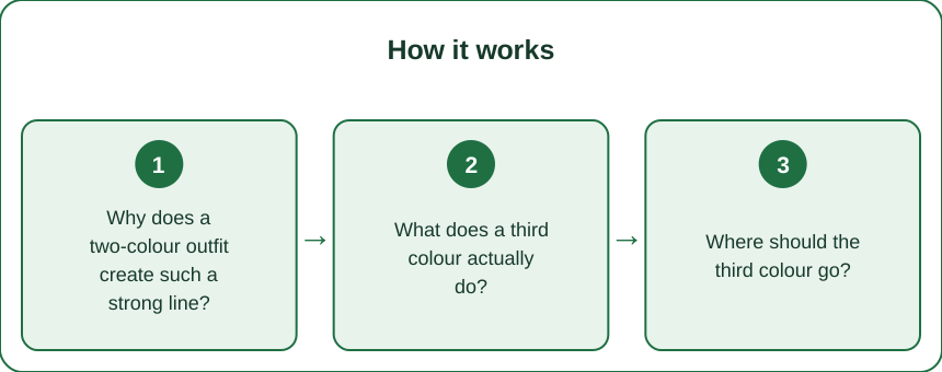
Why does a two-colour outfit create such a strong line?
Because contrast is what the eye finds first, and there is only one place to look.
High contrast between adjacent areas creates a visual edge, and edges are what your visual system uses to segment a scene. In a two-colour outfit, there is exactly one such edge across your body, and it becomes the single most informative line in the image.
Your eye reads that line as the waist. Whether or not it is. A top ending at your hip in a two-colour outfit reads as a long torso and short legs, purely because the break is low - not because of anything about your actual proportions.
Which means the break location does more work than the garment cut. A wide-leg trouser and a straight-leg trouser in the same colour, worn with the same top, produce a very similar proportional read - because the line is in the same place. This is why changing trousers so often fails to fix the problem.
And the higher the contrast, the stronger the effect. Black and white is the maximum case - the line is unmissable. Two mid-tones close in value produce a much softer edge and a far less decisive read.
So there are two levers, not one: where the line sits, and how loud it is. Most styling advice covers only the first.
What does a third colour actually do?
It divides attention, and attention is the whole mechanism.
Three colour blocks create two edges instead of one. Neither edge can carry the same weight, so no single line defines your proportions. The eye moves between them rather than settling.
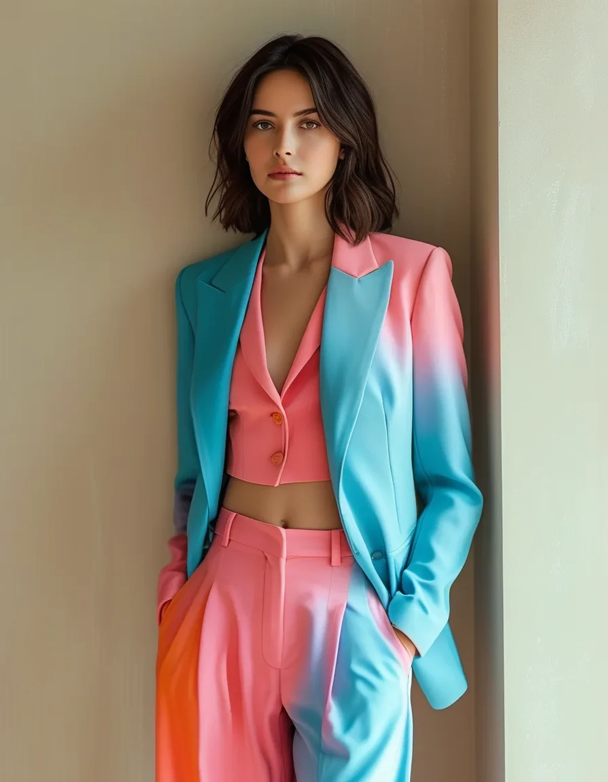
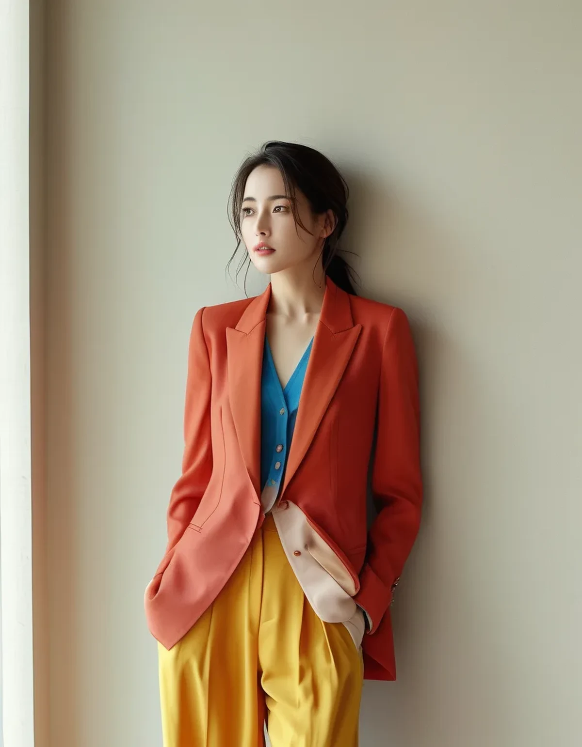
This gives you room to place a high break. With a third layer - a jacket, a cardigan, a shirt worn open - you can create a visual line at your natural waist or above even when the top itself ends low. The third piece supplies the line you wanted.
A vertical third colour changes things even more. An open jacket or long cardigan introduces two vertical lines down your sides, and vertical lines read as length while horizontal lines read as width. This is why an open layer is the single most reliable proportion tool available - it adds verticals without adding a horizontal.
It also lets you use colour placement deliberately. The lightest or brightest of the three colours draws the eye. Put it where you want attention - near the face is the usual answer - and the darker blocks recede.
And it makes an outfit read as composed rather than assembled. Two pieces read as clothing; three read as an outfit, which is a large part of why the same wardrobe looks better on some days than others with no new purchases involved.
Where should the third colour go?
Four placements, each solving a different problem.
As an open outer layer, for maximum length. A jacket, shirt, or long cardigan worn open. The two vertical lines it creates are the strongest lengthening tool in styling, and it works with almost any base outfit. Longer layers create longer verticals; the length of the layer matters less than the fact that it is open.
As a high break, to lengthen the leg line. A cropped or tucked third piece that creates a line at or above the natural waist. This works when the base outfit’s break is too low.
At the extremities, to frame. Shoes, bag, or a scarf in the third colour. A shoe that contrasts with the trouser shortens the leg line by creating a break at the ankle; a shoe close in tone to the trouser extends it. This is one of the highest-leverage and least-noticed choices in an outfit.
Near the face, to direct attention upward. A scarf, collar, or top layer in the brightest of the three. The eye goes to the highest-contrast area, so putting it high pulls the whole read upward.
And one placement to be careful with: the middle. A third colour that sits as a horizontal band at the widest part of the body adds a strong horizontal exactly where most people do not want one. The same third piece worn open instead of buttoned reverses the effect entirely.
A practical rule for proportion: the larger share of colour in the lower half draws the eye down; the larger share up high draws it up. Three colours let you control that split; two do not.
What Nobody Tells You About Colour and Proportion
Value contrast matters more than hue. How light or dark the colours are does far more work than which colours they are. Two very different hues at the same lightness create a much weaker line than two shades of the same hue at very different lightness. Squinting at an outfit - which collapses hue and leaves only value - is the fastest way to see what the eye actually registers.
A tonal outfit is really a one-colour outfit. Three shades of the same colour create almost no break at all, which is why monochrome and tonal dressing reads as long and uninterrupted. It is the opposite strategy to the three-colour approach and it works for the same underlying reason: it controls where the edges are.
The third colour does not have to be a colour. A texture change at the same tone, or a metallic, creates a softer version of the same effect. Useful when you want the composition without the contrast.
Patterns count as their own block, and their scale changes their behaviour. A small-scale pattern reads as a solid from a distance; a large one reads as several blocks. This is why a large print can disrupt proportions in ways a small one does not.
Shoe colour is the most under-used lever available. A shoe matching your trouser or your skin tone extends the leg line by removing a break at the ankle - and it costs nothing to apply if you already own both options.
And photographs lie in a specific direction. A camera flattens depth, so an outfit’s horizontal lines read stronger in a photo than in person. If you are dressing for photographs, the lines are doing more than you think; if you are dressing for a room, slightly less.
The one that surprises people: adding a third colour usually makes an outfit look simpler, not busier. Three considered blocks read as intentional, where two high-contrast blocks read as a stark statement whether you meant one or not.
When is two colours actually better?
Often - this is a tool, not a rule.
When you want the line where it already is. If the break sits at your natural waist and you like the read, a third colour only dilutes something that is working.
For a deliberately graphic look. High contrast in two blocks is bold and modern. That is a legitimate aesthetic choice, not an error - and adding a third piece would soften exactly the effect you wanted.
In formal contexts, where restraint reads as considered. Two colours, or tonal dressing, generally reads more formal than three.
When the third colour has nowhere useful to go. A third colour placed carelessly - as a horizontal band at the widest point, or as a shoe that chops the leg line - actively makes things worse. Badly placed is worse than absent.
And in very warm weather, where a third layer is impractical. Accessories can carry the third colour instead: a bag, a scarf tied to a bag, or shoes.
The general test is simple: look at the outfit in a mirror and notice where your eye lands first. If it lands where you want attention, the outfit is working. If it lands on a hard horizontal line you did not intend, that line is the thing to change - and adding, moving, or softening a third colour is usually a faster fix than buying different trousers.
And squint. Genuinely. Squinting removes hue and colour detail and leaves only value blocks, which is close to what someone across a room actually perceives. Most proportion problems become obvious in about two seconds this way, and it costs nothing.
FAQ: Colour and Proportion, Answered
Why does a two-colour outfit look so severe?
It creates exactly one high-contrast edge across your body, and the eye reads that single line as the definitive division of your proportions. There is nothing else competing for attention.
Where should the third colour go for the longest leg line?
Usually as an open outer layer, which adds two vertical lines and no strong horizontal. Failing that, at a high break at or above the natural waist, and in shoes that stay close in tone to the trouser.
Does the third colour have to be an actual different colour?
No. A texture change at a similar tone, or a metallic, produces a softer version of the same effect. Value contrast is what the eye registers, and hue matters less than people assume.
Why do my shoes change how tall I look?
A shoe contrasting with your trouser creates a break at the ankle, visually shortening the leg. A shoe close in tone to the trouser - or to your skin - removes that break and extends the line.
Is three colours always better than two?
No. Two is better when the break already sits where you want it, when you want a deliberately graphic look, in formal settings, or when the third colour has no good placement. Badly placed is worse than absent.
What is the fastest way to check an outfit?
Squint at it in the mirror. Squinting collapses hue and leaves only light and dark blocks, which is close to what someone across a room actually sees. Any unintended horizontal line becomes obvious immediately.
TL;DR:
- A two-colour outfit creates one high-contrast edge, and the eye reads that line as your waist - wherever it actually falls.
- Changing trousers rarely fixes it, because the line stays in the same place.
- A third colour creates a second, weaker break, so no single line defines your proportions.
- The strongest placement is an open outer layer - it adds two vertical lines and no new horizontal.
- Value contrast matters more than hue. Two very different colours at the same lightness create a much softer line than two shades of one colour at different lightness.
- Shoe tone is the most under-used lever: matching the trouser extends the leg line; contrasting cuts it.
- Two colours is better when the break already works, when you want a graphic look, or when the third colour has nowhere useful to sit.
Squint at the mirror. Whatever line survives the squint is the line doing all the work.
Keep Reading
This article is for general informational and styling purposes only. Fit, sizing, and product availability may vary.